We wanted to create a brand that represents Samantha Maria, something warm but with indistinguishable elegance and style, we started by choosing a muted color palette that goes to warmer earth colors to give it a welcoming feeling, the fonts are not only legible but elegant in combination with the stylish imaginary created by Samantha, the product pictures are set to show the jewelry pieces as small sculptures, showing close up of the details, when created the website it was very important for us to have a very easy navigation but at the same time we wanted something that is unique, the idea is that this sidebar navigation accompanies the user thought the whole web experience, in that way there’s always a brand connection between the content and the user, to accentuate creativity I created a series of abstract line illustrations that give fluidity and a relax sense to the brand experience, you can find them in the newsletters and promotional material, integrated in the website and in the packaging design.


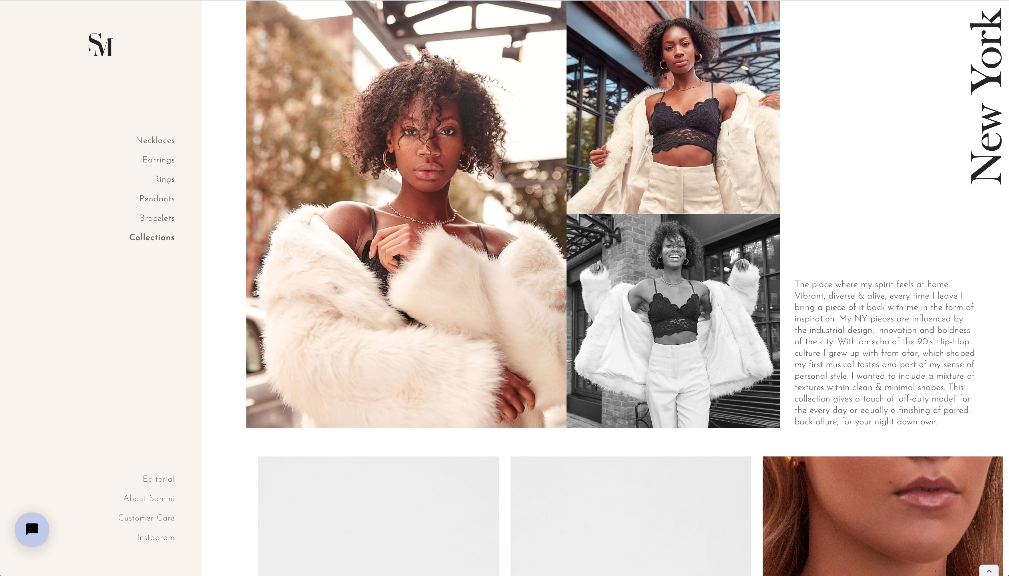
Samantha Maria wanted to create jewellery with a strong sense of self, reminiscent of her own ‘Laid-back City girl’ style, which also holds an emotive memory and reflective moment for her. Having travelled to parts of the world over time, she had coveted and collected rings & necklaces and this nostalgia left inspired her to create a jewellery brand that encompasses those moments. The idea of the brand is to cover values like femininity, strength and elegance, creating a space that reminds us of mood-boards would inspire our creative selves as customers and at the same time makes us feel part of the creative process, we combined delicate abstract illustrations with warm earth tones to give a soft sense of home.